Some Thoughts Some Thoughts Some Thoughts Some Thoughts Some Thoughts Some Thoughts Some Thoughts Some Thoughts Some Thoughts Some Thoughts Some Thoughts Some Thoughts Some Thoughts Some Thoughts Some Thoughts Some Thoughts Some Thoughts Some Thoughts Some Thoughts Some Thoughts Some Thoughts Some Thoughts Some Thoughts Some Thoughts Some Thoughts Some Thoughts Some Thoughts Some Thoughts Some Thoughts Some Thoughts Some Thoughts Some Thoughts Some Thoughts Some Thoughts Some Thoughts Some Thoughts Some Thoughts Some Thoughts Some Thoughts Some Thoughts Some Thoughts Some Thoughts Some Thoughts Some Thoughts Some Thoughts Some Thoughts Some Thoughts Some Thoughts Some Thoughts Some Thoughts Some Thoughts Some Thoughts Some Thoughts Some Thoughts Some Thoughts Some Thoughts Some Thoughts Some Thoughts Some Thoughts Some Thoughts Some Thoughts Some Thoughts Some Thoughts Some Thoughts Some Thoughts Some Thoughts Some Thoughts Some Thoughts Some Thoughts Some Thoughts Some Thoughts Some Thoughts Some Thoughts Some Thoughts Some Thoughts Some Thoughts Some Thoughts Some Thoughts Some Thoughts Some Thoughts Some Thoughts Some Thoughts Some Thoughts Some Thoughts Some Thoughts Some Thoughts Some Thoughts Some Thoughts Some Thoughts Some Thoughts Some Thoughts Some Thoughts Some Thoughts Some Thoughts Some Thoughts Some Thoughts Some Thoughts Some Thoughts Some Thoughts Some Thoughts Some Thoughts Some Thoughts Some Thoughts Some Thoughts Some Thoughts Some Thoughts Some Thoughts Some Thoughts Some Thoughts Some Thoughts Some Thoughts Some Thoughts

Ontario Covid-19 Data Viz

Some Thoughts Some Thoughts Some Thoughts Some Thoughts Some Thoughts Some Thoughts Some Thoughts Some Thoughts Some Thoughts Some Thoughts Some Thoughts Some Thoughts Some Thoughts Some Thoughts Some Thoughts Some Thoughts Some Thoughts Some Thoughts Some Thoughts Some Thoughts Some Thoughts Some Thoughts Some Thoughts Some Thoughts Some Thoughts Some Thoughts Some Thoughts Some Thoughts Some Thoughts Some Thoughts Some Thoughts Some Thoughts Some Thoughts Some Thoughts Some Thoughts Some Thoughts Some Thoughts Some Thoughts Some Thoughts Some Thoughts Some Thoughts Some Thoughts Some Thoughts Some Thoughts Some Thoughts Some Thoughts Some Thoughts Some Thoughts Some Thoughts Some Thoughts Some Thoughts Some Thoughts Some Thoughts Some Thoughts Some Thoughts Some Thoughts Some Thoughts Some Thoughts Some Thoughts Some Thoughts Some Thoughts Some Thoughts Some Thoughts Some Thoughts Some Thoughts Some Thoughts Some Thoughts Some Thoughts Some Thoughts Some Thoughts Some Thoughts Some Thoughts Some Thoughts Some Thoughts Some Thoughts Some Thoughts Some Thoughts Some Thoughts Some Thoughts Some Thoughts Some Thoughts Some Thoughts Some Thoughts Some Thoughts Some Thoughts Some Thoughts Some Thoughts Some Thoughts Some Thoughts Some Thoughts Some Thoughts Some Thoughts Some Thoughts Some Thoughts Some Thoughts Some Thoughts Some Thoughts Some Thoughts Some Thoughts Some Thoughts Some Thoughts Some Thoughts Some Thoughts Some Thoughts Some Thoughts Some Thoughts Some Thoughts Some Thoughts Some Thoughts Some Thoughts Some Thoughts Some Thoughts

We believe data is only as impactful as its delivery

Right now, everyone is being hit with huge amounts of changing, sometimes confusing, and often conflicting information every day. We are all overwhelmed. It’s more important than ever to communicate messages in a simple, clear way so everyone understands what the data shows, what they’re being asked to do, and can feel confident that what they’re doing will keep themselves and others safe.

The brief report presented on April 16, 2021 by the Government of Ontario is a snapshot of data collected over the past year meant to show the potential paths the pandemic could take in the coming weeks depending on measures taken by the government and the community, as well as other supporting statistics.

The importance of people understanding this data can not be overstated, however the way it was communicated was not treated with the same importance as was placed on the collection and accuracy of the data sets. We are not questioning the actual statistics, we want to focus solely on how the statistics have been visually presented and the common mistakes we noticed in many aspects of the presentation.

We ask: what are some easy things that can be done to make this important data more clear and accessible to all audiences? To be clear, we aren’t attempting to redesign these visualizations (although we’d love the chance to!), but we think there is value in at least pointing out a few places they fail to do the job they’re meant to, and show what might have been better choices.

🧐 πŸ€” 🀨 🧐 πŸ€” 🀨 🧐 πŸ€” 🀨 🧐 πŸ€” 🀨 🧐 πŸ€” 🀨 🧐 πŸ€” 🀨 🧐 πŸ€” 🀨 🧐 πŸ€” 🀨 🧐 πŸ€” 🀨 🧐 πŸ€” 🀨 🧐 πŸ€” 🀨 🧐 πŸ€” 🀨 🧐 πŸ€” 🀨 🧐 πŸ€” 🀨 🧐 πŸ€” 🀨 🧐 πŸ€” 🀨 🧐 πŸ€” 🀨 🧐 πŸ€” 🀨 🧐 πŸ€” 🀨 🧐 πŸ€” 🀨 🧐 πŸ€” 🀨 🧐 πŸ€” 🀨 🧐 πŸ€” 🀨 🧐 πŸ€” 🀨 🧐 πŸ€” 🀨 🧐 πŸ€” 🀨 🧐 πŸ€” 🀨 🧐 πŸ€” 🀨 🧐 πŸ€” 🀨 🧐 πŸ€” 🀨 🧐 πŸ€” 🀨 🧐 πŸ€” 🀨 🧐 πŸ€” 🀨 🧐 πŸ€” 🀨 🧐 πŸ€” 🀨 🧐 πŸ€” 🀨 🧐 πŸ€” 🀨 🧐 πŸ€” 🀨 🧐 πŸ€” 🀨 🧐 πŸ€” 🀨 🧐 πŸ€” 🀨 🧐 πŸ€” 🀨 🧐 πŸ€” 🀨 🧐 πŸ€” 🀨 🧐 πŸ€” 🀨 🧐 πŸ€” 🀨 🧐 πŸ€” 🀨 🧐 πŸ€” 🀨 🧐 πŸ€” 🀨 🧐 πŸ€” 🀨 🧐 πŸ€” 🀨 🧐 πŸ€” 🀨 🧐 πŸ€” 🀨 🧐 πŸ€” 🀨 🧐 πŸ€” 🀨 🧐 πŸ€” 🀨 🧐 πŸ€” 🀨 🧐 πŸ€” 🀨 🧐 πŸ€” 🀨 🧐 πŸ€” 🀨 🧐 πŸ€” 🀨 🧐 πŸ€” 🀨 🧐 πŸ€” 🀨 🧐 πŸ€” 🀨 🧐 πŸ€” 🀨 🧐 πŸ€” 🀨 🧐 πŸ€” 🀨 🧐 πŸ€” 🀨 🧐 πŸ€” 🀨 🧐 πŸ€” 🀨 🧐 πŸ€” 🀨 🧐 πŸ€” 🀨 🧐 πŸ€” 🀨 🧐 πŸ€” 🀨 🧐 πŸ€” 🀨 🧐 πŸ€” 🀨 🧐 πŸ€” 🀨 🧐 πŸ€” 🀨 🧐 πŸ€” 🀨 🧐 πŸ€” 🀨 🧐 πŸ€” 🀨 🧐 πŸ€” 🀨 🧐 πŸ€” 🀨 🧐 πŸ€” 🀨 🧐 πŸ€” 🀨 🧐 πŸ€” 🀨 🧐 πŸ€” 🀨 🧐 πŸ€” 🀨 🧐 πŸ€” 🀨 🧐 πŸ€” 🀨 🧐 πŸ€” 🀨 🧐 πŸ€” 🀨 🧐 πŸ€” 🀨 🧐 πŸ€” 🀨 🧐 πŸ€” 🀨 🧐 πŸ€” 🀨 🧐 πŸ€” 🀨 🧐 πŸ€” 🀨 🧐 πŸ€” 🀨 🧐 πŸ€” 🀨 🧐 πŸ€” 🀨 🧐 πŸ€” 🀨 🧐 πŸ€” 🀨 🧐 πŸ€” 🀨 🧐 πŸ€” 🀨 🧐 πŸ€” 🀨 🧐 πŸ€” 🀨 🧐 πŸ€” 🀨 🧐 πŸ€” 🀨 🧐 πŸ€” 🀨 🧐 πŸ€” 🀨 🧐 πŸ€” 🀨 🧐 πŸ€” 🀨 🧐 πŸ€” 🀨 🧐 πŸ€” 🀨 🧐 πŸ€” 🀨 🧐 πŸ€” 🀨

A Closer Look

We considered three important aspects of data visualizations; accessibility, clarity of message, and medium of presentation.

Accessibility

Β 

What: The graphs should pass accessibility guidelines for colour combinations, typography and size.

Why: Not conveying information in a clear and accessible manner leads to confusion for viewers and misunderstanding of the data. Extra caution should be taken to ensure that visual accessibility guidelines are achieved when the information needs to be understood by a large audience.

Clarity

Β 

What: Visuals should use simple, appropriate language to describe what the visualization is showing and, more importantly, the intended message should be clearly and effectively conveyed by the visuals.

Why: If the message isn’t clear and easy to understand, people could misinterpret the visualization or think the data is incorrect, leading to confusion and lack of confidence in the information. Using ambiguous terms, small fonts, and unnecessary figures can lead to more questions than answers.

Medium

Β 

What: Make sure the way the data is being presented is the best choice for the medium it’s being delivered through. For example, take advantage of online or live communication by using small animations in the graphics to make the points easier to understand.

Why: The audience may need more time to digest and understand the information shown, or to break up complex data into pieces that can be explained one at a time. Showing everything at once can sometimes feel overwhelming and render the visual ineffective.

This is by no means an exhaustive analysis, just some thoughts we had after watching the presentation. Below are a few examples illustrating these three issues and providing some simple changes showing what we’ve suggested.

🧐 πŸ€” 🀨 🧐 πŸ€” 🀨 🧐 πŸ€” 🀨 🧐 πŸ€” 🀨 🧐 πŸ€” 🀨 🧐 πŸ€” 🀨 🧐 πŸ€” 🀨 🧐 πŸ€” 🀨 🧐 πŸ€” 🀨 🧐 πŸ€” 🀨 🧐 πŸ€” 🀨 🧐 πŸ€” 🀨 🧐 πŸ€” 🀨 🧐 πŸ€” 🀨 🧐 πŸ€” 🀨 🧐 πŸ€” 🀨 🧐 πŸ€” 🀨 🧐 πŸ€” 🀨 🧐 πŸ€” 🀨 🧐 πŸ€” 🀨 🧐 πŸ€” 🀨 🧐 πŸ€” 🀨 🧐 πŸ€” 🀨 🧐 πŸ€” 🀨 🧐 πŸ€” 🀨 🧐 πŸ€” 🀨 🧐 πŸ€” 🀨 🧐 πŸ€” 🀨 🧐 πŸ€” 🀨 🧐 πŸ€” 🀨 🧐 πŸ€” 🀨 🧐 πŸ€” 🀨 🧐 πŸ€” 🀨 🧐 πŸ€” 🀨 🧐 πŸ€” 🀨 🧐 πŸ€” 🀨 🧐 πŸ€” 🀨 🧐 πŸ€” 🀨 🧐 πŸ€” 🀨 🧐 πŸ€” 🀨 🧐 πŸ€” 🀨 🧐 πŸ€” 🀨 🧐 πŸ€” 🀨 🧐 πŸ€” 🀨 🧐 πŸ€” 🀨 🧐 πŸ€” 🀨 🧐 πŸ€” 🀨 🧐 πŸ€” 🀨 🧐 πŸ€” 🀨 🧐 πŸ€” 🀨 🧐 πŸ€” 🀨 🧐 πŸ€” 🀨 🧐 πŸ€” 🀨 🧐 πŸ€” 🀨 🧐 πŸ€” 🀨 🧐 πŸ€” 🀨 🧐 πŸ€” 🀨 🧐 πŸ€” 🀨 🧐 πŸ€” 🀨 🧐 πŸ€” 🀨 🧐 πŸ€” 🀨 🧐 πŸ€” 🀨 🧐 πŸ€” 🀨 🧐 πŸ€” 🀨 🧐 πŸ€” 🀨 🧐 πŸ€” 🀨 🧐 πŸ€” 🀨 🧐 πŸ€” 🀨 🧐 πŸ€” 🀨 🧐 πŸ€” 🀨 🧐 πŸ€” 🀨 🧐 πŸ€” 🀨 🧐 πŸ€” 🀨 🧐 πŸ€” 🀨 🧐 πŸ€” 🀨 🧐 πŸ€” 🀨 🧐 πŸ€” 🀨 🧐 πŸ€” 🀨 🧐 πŸ€” 🀨 🧐 πŸ€” 🀨 🧐 πŸ€” 🀨 🧐 πŸ€” 🀨 🧐 πŸ€” 🀨 🧐 πŸ€” 🀨 🧐 πŸ€” 🀨 🧐 πŸ€” 🀨 🧐 πŸ€” 🀨 🧐 πŸ€” 🀨 🧐 πŸ€” 🀨 🧐 πŸ€” 🀨 🧐 πŸ€” 🀨 🧐 πŸ€” 🀨 🧐 πŸ€” 🀨 🧐 πŸ€” 🀨 🧐 πŸ€” 🀨 🧐 πŸ€” 🀨 🧐 πŸ€” 🀨 🧐 πŸ€” 🀨 🧐 πŸ€” 🀨 🧐 πŸ€” 🀨 🧐 πŸ€” 🀨 🧐 πŸ€” 🀨 🧐 πŸ€” 🀨 🧐 πŸ€” 🀨 🧐 πŸ€” 🀨 🧐 πŸ€” 🀨 🧐 πŸ€” 🀨 🧐 πŸ€” 🀨 🧐 πŸ€” 🀨 🧐 πŸ€” 🀨 🧐 πŸ€” 🀨 🧐 πŸ€” 🀨 🧐 πŸ€” 🀨 🧐 πŸ€” 🀨 🧐 πŸ€” 🀨 🧐 πŸ€” 🀨 🧐 πŸ€” 🀨

Accessibility

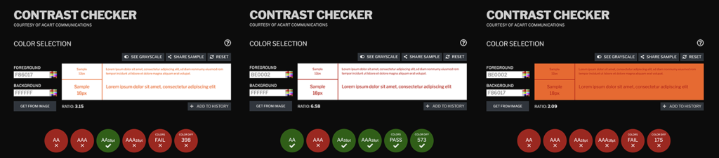
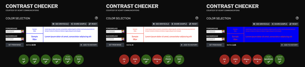
First, we ran all of the graphs through a contrast checker to see whether the colours actually worked. To get a quick idea of this, scan the image below and keep an eye on the last two circles on each outputβ€”they should be green to indicate a pass. We found that only a handful were actually accessible!Β 

Here’s another look in detail:

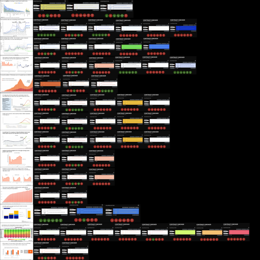
This graph presents a few problems with accessibility that are common throughout the report:

a) the colours used do not have a high enough contrast with each other and could be difficult to distinguish for those with visual impairments, and

b) the font size used on the axes is too small and difficult to read, making it hard to understand what the graph is showing.

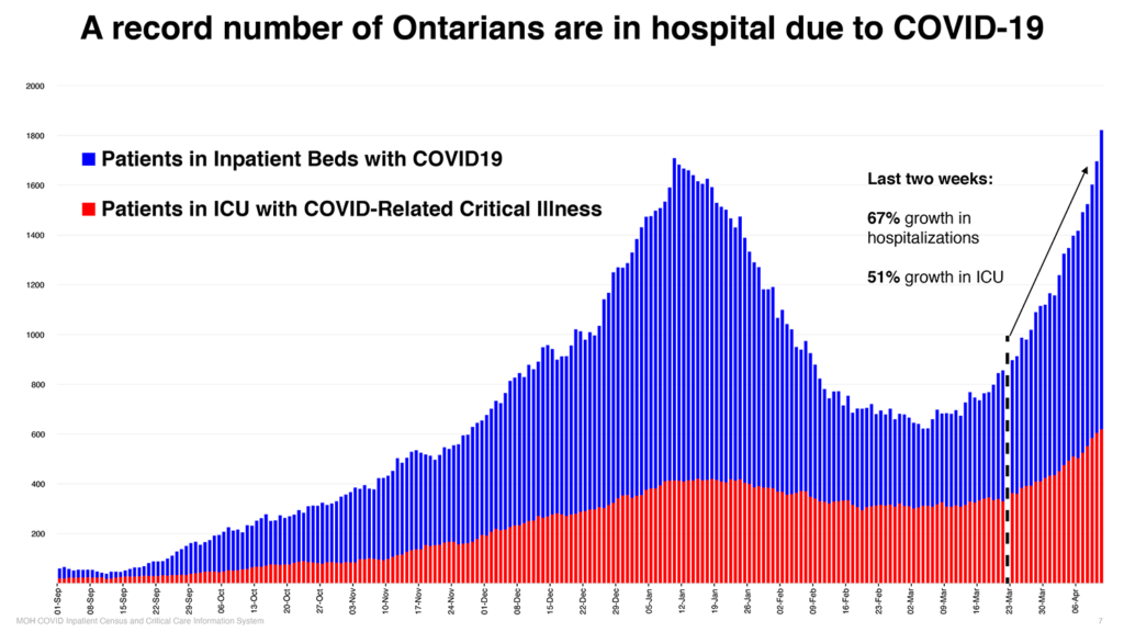
To remedy the issues with colour, it’s a great idea to choose very high contrast colours and even better to test graphics with an online tool that quickly tells you if it passes standards for accessibility. Also, to further improve readability it helps to use clear, accessible fonts and increase the font size and spacing on the x-axis to make everything more legible to most audiences.

🧐 πŸ€” 🀨 🧐 πŸ€” 🀨 🧐 πŸ€” 🀨 🧐 πŸ€” 🀨 🧐 πŸ€” 🀨 🧐 πŸ€” 🀨 🧐 πŸ€” 🀨 🧐 πŸ€” 🀨 🧐 πŸ€” 🀨 🧐 πŸ€” 🀨 🧐 πŸ€” 🀨 🧐 πŸ€” 🀨 🧐 πŸ€” 🀨 🧐 πŸ€” 🀨 🧐 πŸ€” 🀨 🧐 πŸ€” 🀨 🧐 πŸ€” 🀨 🧐 πŸ€” 🀨 🧐 πŸ€” 🀨 🧐 πŸ€” 🀨 🧐 πŸ€” 🀨 🧐 πŸ€” 🀨 🧐 πŸ€” 🀨 🧐 πŸ€” 🀨 🧐 πŸ€” 🀨 🧐 πŸ€” 🀨 🧐 πŸ€” 🀨 🧐 πŸ€” 🀨 🧐 πŸ€” 🀨 🧐 πŸ€” 🀨 🧐 πŸ€” 🀨 🧐 πŸ€” 🀨 🧐 πŸ€” 🀨 🧐 πŸ€” 🀨 🧐 πŸ€” 🀨 🧐 πŸ€” 🀨 🧐 πŸ€” 🀨 🧐 πŸ€” 🀨 🧐 πŸ€” 🀨 🧐 πŸ€” 🀨 🧐 πŸ€” 🀨 🧐 πŸ€” 🀨 🧐 πŸ€” 🀨 🧐 πŸ€” 🀨 🧐 πŸ€” 🀨 🧐 πŸ€” 🀨 🧐 πŸ€” 🀨 🧐 πŸ€” 🀨 🧐 πŸ€” 🀨 🧐 πŸ€” 🀨 🧐 πŸ€” 🀨 🧐 πŸ€” 🀨 🧐 πŸ€” 🀨 🧐 πŸ€” 🀨 🧐 πŸ€” 🀨 🧐 πŸ€” 🀨 🧐 πŸ€” 🀨 🧐 πŸ€” 🀨 🧐 πŸ€” 🀨 🧐 πŸ€” 🀨 🧐 πŸ€” 🀨 🧐 πŸ€” 🀨 🧐 πŸ€” 🀨 🧐 πŸ€” 🀨 🧐 πŸ€” 🀨 🧐 πŸ€” 🀨 🧐 πŸ€” 🀨 🧐 πŸ€” 🀨 🧐 πŸ€” 🀨 🧐 πŸ€” 🀨 🧐 πŸ€” 🀨 🧐 πŸ€” 🀨 🧐 πŸ€” 🀨 🧐 πŸ€” 🀨 🧐 πŸ€” 🀨 🧐 πŸ€” 🀨 🧐 πŸ€” 🀨 🧐 πŸ€” 🀨 🧐 πŸ€” 🀨 🧐 πŸ€” 🀨 🧐 πŸ€” 🀨 🧐 πŸ€” 🀨 🧐 πŸ€” 🀨 🧐 πŸ€” 🀨 🧐 πŸ€” 🀨 🧐 πŸ€” 🀨 🧐 πŸ€” 🀨 🧐 πŸ€” 🀨 🧐 πŸ€” 🀨 🧐 πŸ€” 🀨 🧐 πŸ€” 🀨 🧐 πŸ€” 🀨 🧐 πŸ€” 🀨 🧐 πŸ€” 🀨 🧐 πŸ€” 🀨 🧐 πŸ€” 🀨 🧐 πŸ€” 🀨 🧐 πŸ€” 🀨 🧐 πŸ€” 🀨 🧐 πŸ€” 🀨 🧐 πŸ€” 🀨 🧐 πŸ€” 🀨 🧐 πŸ€” 🀨 🧐 πŸ€” 🀨 🧐 πŸ€” 🀨 🧐 πŸ€” 🀨 🧐 πŸ€” 🀨 🧐 πŸ€” 🀨 🧐 πŸ€” 🀨 🧐 πŸ€” 🀨 🧐 πŸ€” 🀨 🧐 πŸ€” 🀨 🧐 πŸ€” 🀨 🧐 πŸ€” 🀨 🧐 πŸ€” 🀨 🧐 πŸ€” 🀨 🧐 πŸ€” 🀨

Clarity

Using data visualizations to illustate a statement or message and make it easier to understand can be extremely valuable. The opposite can be true if the visuals are hard to decipher or if the graphic doesn’t clearly show data that supports the intended message.

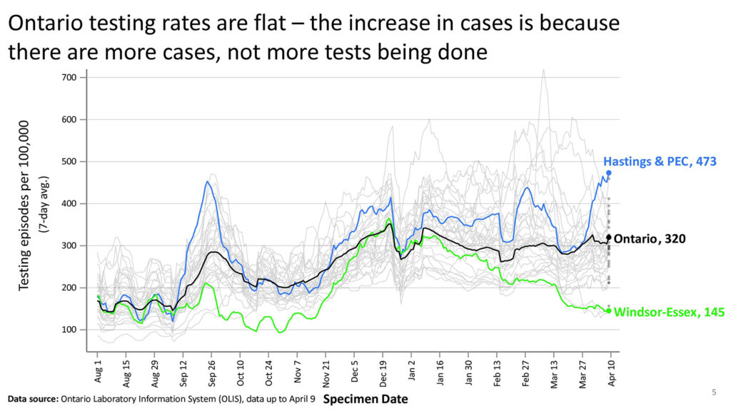
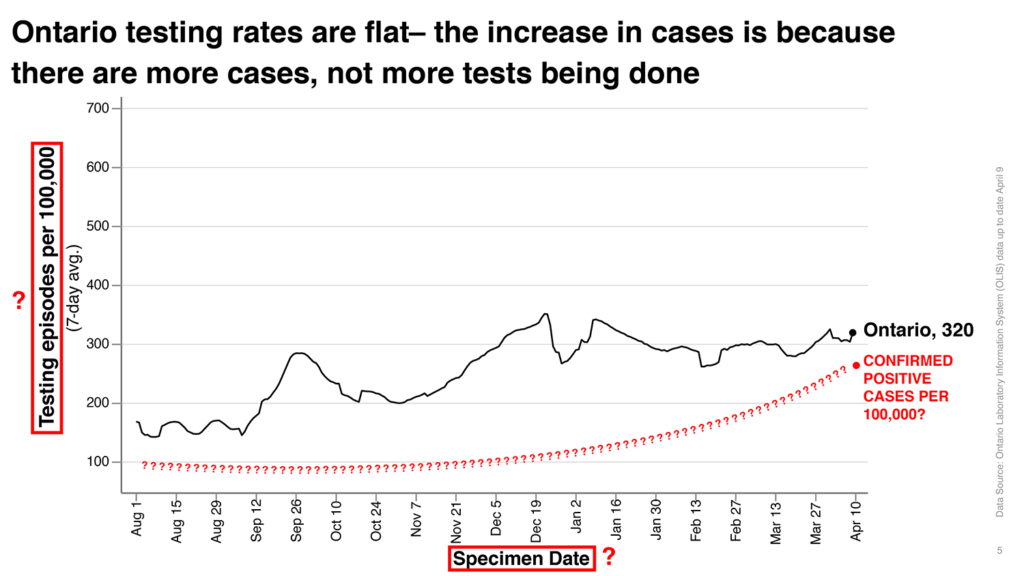
This graph intends to show data to support the statement that the increase in the number of cases of Covid-19 in Ontario in recent months is not because more tests are being processedβ€”that is, confirmed cases are increasing while the number of tests being done per capita have remained steady in recent months. However, the message is lost when you look to the graph for supporting information because:

a) the labelling on axes uses undefined terminology that isn’t obvious in its meaning to the average person,

b) the graph includes many lines representing data that isn’t relevant to the message, and some (ie the many grey lines) which aren’t labelled at all, and

c) it doesn’t include data for one of statistics (the increasing number of cases) referred to in the statement.

To make it easier for people to understand how the data supports the statement being made, choosing unambiguous terms or providing a definition of terms on the graph is a good idea. More importantly, by only including the data that’s directly relevant to the message it makes it more likely people will see the connection between the graphic and the message, which will help them to feel confident the statement being made is correct or accurate.

🧐 πŸ€” 🀨 🧐 πŸ€” 🀨 🧐 πŸ€” 🀨 🧐 πŸ€” 🀨 🧐 πŸ€” 🀨 🧐 πŸ€” 🀨 🧐 πŸ€” 🀨 🧐 πŸ€” 🀨 🧐 πŸ€” 🀨 🧐 πŸ€” 🀨 🧐 πŸ€” 🀨 🧐 πŸ€” 🀨 🧐 πŸ€” 🀨 🧐 πŸ€” 🀨 🧐 πŸ€” 🀨 🧐 πŸ€” 🀨 🧐 πŸ€” 🀨 🧐 πŸ€” 🀨 🧐 πŸ€” 🀨 🧐 πŸ€” 🀨 🧐 πŸ€” 🀨 🧐 πŸ€” 🀨 🧐 πŸ€” 🀨 🧐 πŸ€” 🀨 🧐 πŸ€” 🀨 🧐 πŸ€” 🀨 🧐 πŸ€” 🀨 🧐 πŸ€” 🀨 🧐 πŸ€” 🀨 🧐 πŸ€” 🀨 🧐 πŸ€” 🀨 🧐 πŸ€” 🀨 🧐 πŸ€” 🀨 🧐 πŸ€” 🀨 🧐 πŸ€” 🀨 🧐 πŸ€” 🀨 🧐 πŸ€” 🀨 🧐 πŸ€” 🀨 🧐 πŸ€” 🀨 🧐 πŸ€” 🀨 🧐 πŸ€” 🀨 🧐 πŸ€” 🀨 🧐 πŸ€” 🀨 🧐 πŸ€” 🀨 🧐 πŸ€” 🀨 🧐 πŸ€” 🀨 🧐 πŸ€” 🀨 🧐 πŸ€” 🀨 🧐 πŸ€” 🀨 🧐 πŸ€” 🀨 🧐 πŸ€” 🀨 🧐 πŸ€” 🀨 🧐 πŸ€” 🀨 🧐 πŸ€” 🀨 🧐 πŸ€” 🀨 🧐 πŸ€” 🀨 🧐 πŸ€” 🀨 🧐 πŸ€” 🀨 🧐 πŸ€” 🀨 🧐 πŸ€” 🀨 🧐 πŸ€” 🀨 🧐 πŸ€” 🀨 🧐 πŸ€” 🀨 🧐 πŸ€” 🀨 🧐 πŸ€” 🀨 🧐 πŸ€” 🀨 🧐 πŸ€” 🀨 🧐 πŸ€” 🀨 🧐 πŸ€” 🀨 🧐 πŸ€” 🀨 🧐 πŸ€” 🀨 🧐 πŸ€” 🀨 🧐 πŸ€” 🀨 🧐 πŸ€” 🀨 🧐 πŸ€” 🀨 🧐 πŸ€” 🀨 🧐 πŸ€” 🀨 🧐 πŸ€” 🀨 🧐 πŸ€” 🀨 🧐 πŸ€” 🀨 🧐 πŸ€” 🀨 🧐 πŸ€” 🀨 🧐 πŸ€” 🀨 🧐 πŸ€” 🀨 🧐 πŸ€” 🀨 🧐 πŸ€” 🀨 🧐 πŸ€” 🀨 🧐 πŸ€” 🀨 🧐 πŸ€” 🀨 🧐 πŸ€” 🀨 🧐 πŸ€” 🀨 🧐 πŸ€” 🀨 🧐 πŸ€” 🀨 🧐 πŸ€” 🀨 🧐 πŸ€” 🀨 🧐 πŸ€” 🀨 🧐 πŸ€” 🀨 🧐 πŸ€” 🀨 🧐 πŸ€” 🀨 🧐 πŸ€” 🀨 🧐 πŸ€” 🀨 🧐 πŸ€” 🀨 🧐 πŸ€” 🀨 🧐 πŸ€” 🀨 🧐 πŸ€” 🀨 🧐 πŸ€” 🀨 🧐 πŸ€” 🀨 🧐 πŸ€” 🀨 🧐 πŸ€” 🀨 🧐 πŸ€” 🀨 🧐 πŸ€” 🀨 🧐 πŸ€” 🀨 🧐 πŸ€” 🀨 🧐 πŸ€” 🀨 🧐 πŸ€” 🀨 🧐 πŸ€” 🀨 🧐 πŸ€” 🀨

Medium

Different mediums have different strengths that can be taken advantage of to make visual communication more effective. Considering the delivery method in this specific situation (giving a presentation by video over TV and online), there are many small ways to tailor the delivery of information to the medium. For example, using simple animations to allow for the complex information being presented to be shared in smaller chunks and at a pace that gives the viewer time to digest and understand what is being shown and what it means to them. Most people need some time to take in what they’re seeing or hearing in order to fully understand it. In the graph below, there are 5 scenarios based on multiple factors shown all at once.

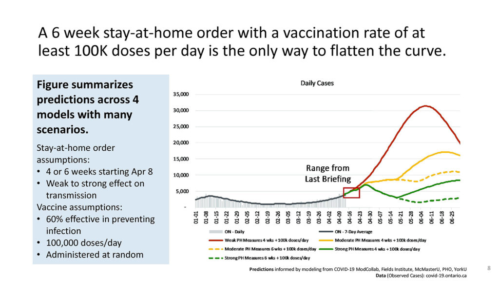
Displaying the graph using animations breaks down the information into more digestible bits for the viewer and helps tell a story that makes the message have more impact.

🧐 πŸ€” 🀨 🧐 πŸ€” 🀨 🧐 πŸ€” 🀨 🧐 πŸ€” 🀨 🧐 πŸ€” 🀨 🧐 πŸ€” 🀨 🧐 πŸ€” 🀨 🧐 πŸ€” 🀨 🧐 πŸ€” 🀨 🧐 πŸ€” 🀨 🧐 πŸ€” 🀨 🧐 πŸ€” 🀨 🧐 πŸ€” 🀨 🧐 πŸ€” 🀨 🧐 πŸ€” 🀨 🧐 πŸ€” 🀨 🧐 πŸ€” 🀨 🧐 πŸ€” 🀨 🧐 πŸ€” 🀨 🧐 πŸ€” 🀨 🧐 πŸ€” 🀨 🧐 πŸ€” 🀨 🧐 πŸ€” 🀨 🧐 πŸ€” 🀨 🧐 πŸ€” 🀨 🧐 πŸ€” 🀨 🧐 πŸ€” 🀨 🧐 πŸ€” 🀨 🧐 πŸ€” 🀨 🧐 πŸ€” 🀨 🧐 πŸ€” 🀨 🧐 πŸ€” 🀨 🧐 πŸ€” 🀨 🧐 πŸ€” 🀨 🧐 πŸ€” 🀨 🧐 πŸ€” 🀨 🧐 πŸ€” 🀨 🧐 πŸ€” 🀨 🧐 πŸ€” 🀨 🧐 πŸ€” 🀨 🧐 πŸ€” 🀨 🧐 πŸ€” 🀨 🧐 πŸ€” 🀨 🧐 πŸ€” 🀨 🧐 πŸ€” 🀨 🧐 πŸ€” 🀨 🧐 πŸ€” 🀨 🧐 πŸ€” 🀨 🧐 πŸ€” 🀨 🧐 πŸ€” 🀨 🧐 πŸ€” 🀨 🧐 πŸ€” 🀨 🧐 πŸ€” 🀨 🧐 πŸ€” 🀨 🧐 πŸ€” 🀨 🧐 πŸ€” 🀨 🧐 πŸ€” 🀨 🧐 πŸ€” 🀨 🧐 πŸ€” 🀨 🧐 πŸ€” 🀨 🧐 πŸ€” 🀨 🧐 πŸ€” 🀨 🧐 πŸ€” 🀨 🧐 πŸ€” 🀨 🧐 πŸ€” 🀨 🧐 πŸ€” 🀨 🧐 πŸ€” 🀨 🧐 πŸ€” 🀨 🧐 πŸ€” 🀨 🧐 πŸ€” 🀨 🧐 πŸ€” 🀨 🧐 πŸ€” 🀨 🧐 πŸ€” 🀨 🧐 πŸ€” 🀨 🧐 πŸ€” 🀨 🧐 πŸ€” 🀨 🧐 πŸ€” 🀨 🧐 πŸ€” 🀨 🧐 πŸ€” 🀨 🧐 πŸ€” 🀨 🧐 πŸ€” 🀨 🧐 πŸ€” 🀨 🧐 πŸ€” 🀨 🧐 πŸ€” 🀨 🧐 πŸ€” 🀨 🧐 πŸ€” 🀨 🧐 πŸ€” 🀨 🧐 πŸ€” 🀨 🧐 πŸ€” 🀨 🧐 πŸ€” 🀨 🧐 πŸ€” 🀨 🧐 πŸ€” 🀨 🧐 πŸ€” 🀨 🧐 πŸ€” 🀨 🧐 πŸ€” 🀨 🧐 πŸ€” 🀨 🧐 πŸ€” 🀨 🧐 πŸ€” 🀨 🧐 πŸ€” 🀨 🧐 πŸ€” 🀨 🧐 πŸ€” 🀨 🧐 πŸ€” 🀨 🧐 πŸ€” 🀨 🧐 πŸ€” 🀨 🧐 πŸ€” 🀨 🧐 πŸ€” 🀨 🧐 πŸ€” 🀨 🧐 πŸ€” 🀨 🧐 πŸ€” 🀨 🧐 πŸ€” 🀨 🧐 πŸ€” 🀨 🧐 πŸ€” 🀨 🧐 πŸ€” 🀨 🧐 πŸ€” 🀨 🧐 πŸ€” 🀨 🧐 πŸ€” 🀨 🧐 πŸ€” 🀨

We love you all

We want everyone to be safe and healthy, and for that to happen people need to understand what’s going on, trust what they’re being told to do, and be shown the results their actions have produced. Making important data accessible and easy to understand can help keep us all safe, but…DELIVERY MATTERS!

Some resources:

  1. Science Table’s Update on COVID-19 Projections – Originally telecast on April 16, 2021
  2. Web Content Accessibility Guidelines (WCAG) – Yes, they are technically meant for the web, but are useful for any screen-based designs.
  3. WCAG – Contrast Checker – The contrast-checker we used, please note that there are a ton available based on the guidelines!
  4. Accessibility – A Practical Handbook on Accessible Graphic Design – A quick guide by the RGD in Canada on making accessible graphics